
One of the first steps a painter takes is that of assembling together the colors that will be laid on the canvas. This involves selecting a set of pigments, laying them out on a palette and mixing them. During this process, each decision moves the color of the paint across three dimensions: hue, saturation (chromaticity) and value (lightness). In theory, these dimensions are independent, or orthogonal. This means you can change the value along one dimension while keeping others constant. Most digital color pickers are built on this assumption: you can pick a hue on one axis and adjust saturation and lightness on another.
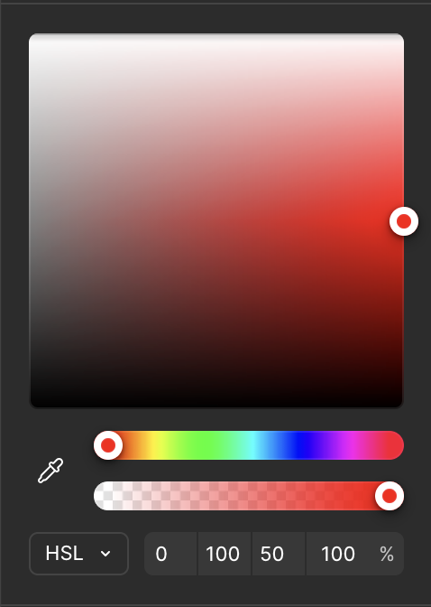
Figma’s HSL color picker: hue on one slider, saturation and lightness on a 2D plane.
Physical pigments, however are not as simple. For example, in order to de-saturate the green color of a tree as it vanishes into the horizon, you’ll generally want to add a colder color to it, such as blue. But by adding blue, you also shift the hue towards… blue! This means that in practice, the dimensions aren’t actually independent. It turns out that mixing color pigments involves a kind of multidimensional dance, which experienced painters perform seamlessly. Performing this process adequately has an impact on the confidence of your brushstrokes and the overall fluidity of your artwork. In fact, the more problems the painter can solve ahead of laying their brush on the canvas, the more enjoyable the process for them and the more free-flowing your painting will feel to the viewer.
Now, some shortcuts can be taken, namely using very few or lots of pigments. If you have too few pigments, you have little expressiveness and it may be unclear whether a certain color in your reference is even achievable. On the other hand, the more pigments you have, the more degrees of freedom, and hence more complexity. This complexity grows combinatorially: not only do you have more possible mixtures to consider, but many different mixtures can yield the same color! This makes it much harder to reason about which path to take. For a beginner, it’s a recipe for disaster.
Wanna try? Here: I’ll give you a color and you need to find out which mix achieves it!
Now, it should be no surprise to you that mastering the pigment mixing process takes years of practice. You just can’t develop an intuition for how specific color pigments will interact with one another across hue saturation and value just by watching video tutorials and reading books. You must paint, again and again, ideally with some guidance, but knowing that the process will be tedious.
But how tedious does it really need to be? Is frustration necessary for learning, or can skillful effort be sufficient?
Let us formulate our problem statement:
- What does the full range of perceivable colors look like?
Which colors can I achieve with the pigments on my palette?
How close can I get to a target color given my available pigments?
These challenges are well-suited to what Bret Victor calls Seeing Spaces: environments that make invisible relationships visible by giving you immediate, spatial representations of abstract data. Instead of holding mental models in your head and guessing at outcomes, you see the entire possibility space laid out before you.
For color mixing, this means visualizing all three color dimensions simultaneously as you work. The tool for this is a color space: a 3D coordinate system where every possible color occupies a unique position. There are a wide variety of color spaces, but the ones that matter for painting are those that are perceptually accurate. That’s because transitions between colors end up informing mixing decisions.
But seeing spaces only really work when they’re seamlessly integrated into the user’s environment. They must also be highly responsive and conceptually powerful. That’s a lot to ask from a smartphone, tablet or desktop. None of these devices can be integrated into the painting flow without disrupting it.
Luckily, we are entering the age of AR glasses and I got a pair of Spectacles.
With the hardware sorted, I needed to decide what exactly to visualize. I had three goals in mind:
- See where a color on my palette sits in the color space, so when I change its mixture, I can track the result.
- See which colors are reachable by mixing my available pigments, via what is called a color gamut.
- See how a target color maps onto my gamut: what’s the closest I can get to a reference color with my pigments?
The sRGB space, which we’ll improperly abbreviate as RGB, is the obvious starting point, but because of its perceptual inaccuracy, it’s a poor fit for this problem.
CIELAB, for instance, is better suited: it’s designed so that equal distances in the space correspond to equal perceived color differences. This is also an intuitive choice for painters who are generally familiar with Munsell Color System. CIELAB works the same way: lightness on the vertical axis, hue as rotation, and saturation as distance from center.
Next, I needed to figure out how to render this space. Solid meshes only show the surface, and volume raymarching is too expensive for AR (which renders stereo at 1.5x normal framerates). So I turned to particles.
VFX Particles
I’ll tell you one thing: Lens Studio’s VFX Editor is fun to use. It’s like a stylish combo of Unity’s Visual Effects Graph and Blender’s GeoNode Editor with some sparks of Houdini VOP brilliance.
Now, it doesn’t come without its own quirks, especially regarding my use case.
The main challenge was encoding the position of every element of the color space so that it could be read by the VFX editor and used to modify particle attributes.
Figuring out a good encoding strategy was tricky. I stumbled on the lack of support for floating point textures in Lens Studio 5.15. Fortunately, the tutorial Spawn Particles on Mesh helped with this. I also had to deal with a peculiarity where the integer index of particles in the VFX Editor is always even. As a result, I had to spawn twice as many particles as those actually displayed. This was painful to debug, but eventually I settled on a suitable workflow.
The encoder material writes position and color data into render textures. The script orchestrates the pipeline, creating render targets and connecting the material output to the VFX input. Finally, the VFX decoder spawns particles, sampling the render textures to set each particle’s position and color.
Here’s the result:
Now, as happy as I was to have overcome those technical hurdles, the performance just wasn’t there. Adding 3 such VFX to my scene would visibly reduce framerate, which drastically deteriorates user experience. Rendering particles as billboard quads instead of 3D meshes helped, but the improvement wasn’t satisfactory.
At this point I hit a wall. As it happened, I had to travel to Brussels and Eindhoven for UnitedXR and the Spectacles x 3EALITY hackathon, which gave me a chance to step away from the problem.
When I came back,
Here’s a manim visualization that showcases this process:

It was clear then that I didn’t need a system as flexible as VFX particles to accommodate any arbitrary spatial layout.
I could
Procedural Meshes
In Lens Studio, you can create meshes procedurally. Using the MeshBuilder API, you can specify vertex positions and store any attribute you like. Then, you can assign a material that alters the position of those vertices. When I tried this, I was mindblown by the performance improvement.
Though the procedural mesh generation was quite delicate, once done I could essentially let my imagination run wild. And since vertices are looped over in the GPU via vertex shaders, I didn’t have to worry about their count.
To make the process of low-level geometry construction and manipulation more, let’s say… humane, I used a coding agent supplemented with a
I initially went for lines. It came up as a good balance of volumetric space-filling and low polycount.
Then, I tried spawning cubes and repositioning their vertices. The performance was great, much better than VFX particles rendered as cube meshes. I suspect this is due to memory allocation niceties of the MeshBuilder API, coupled with not creating any new geometry at runtime.
Having cleared a path towards seamless rendering of color spaces, I could now tackle the painting workflow pain points mentioned earlier.
The complete CIELAB color space, rendered as a grid of cubes. We can now see the full range of perceivable colors and where any given color sits within it. Solves Problem 1.
This workflow computes the gamut of a set of pigments via three-way subtractive mixing. With it, we can see which colors are achievable with a given palette. Solves Problem 2.
This workflow projects a color onto the gamut boundary. Given a set of pigments and a target color, we now know in advance which achievable color is closest. Solves Problem 3.
And one final demo in-editor, because we can’t go out there not looking
In Part 1, we saw how to sample colors from our environment, which gives us the colors on our palette. In Part 2, we’ve managed to see, via computational tools, where those pigments can take us.
But this is still too abstract. We need additional steps to blend these seeing spaces into a coherent user experience.
Ideally, we’d like to preview the scene around us under the constraint of the pigments at our disposal, and have our assistant guide us towards achieving something close to our reference without disrupting our flow or limiting our creative freedom.